What you wear for senior photos matters more than people expect, because the backdrops up here are bold. Red rock, granite, and pine are strong colors, and the goal is to stand out against them, not blend in or fight them. Here’s how I’d think about it.
Colors that work against Arizona backdrops
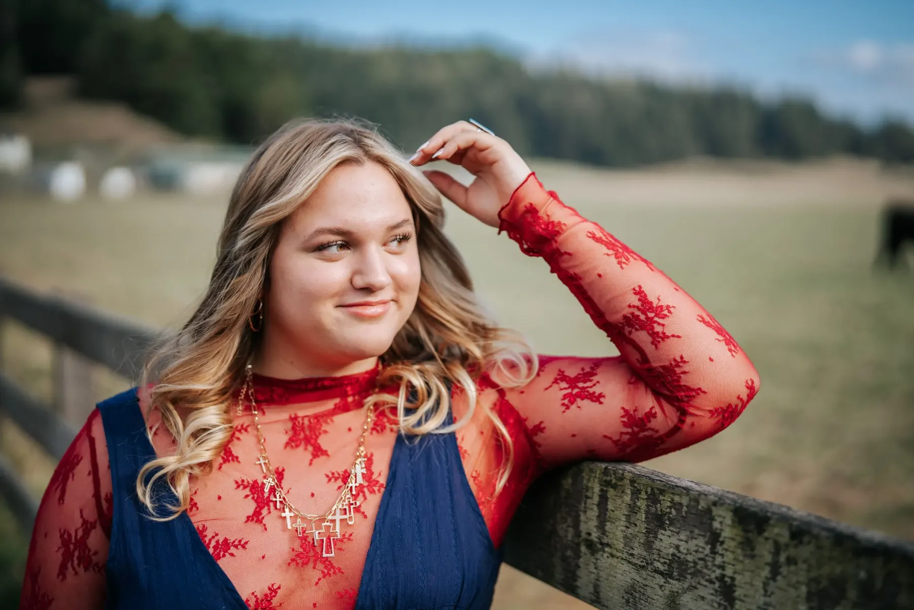
- Earth tones, creams, rust, and soft neutrals read beautifully against red rock and granite. They feel like they belong.
- Deeper solids, a forest green, a navy, a burgundy, hold up well in the pines around Flagstaff.
- Avoid bright logos and busy patterns. They pull the eye off the senior’s face and date the photos fast.
The simplest rule: pick colors that complement the rock and the trees instead of clashing with them.
Bring layers and a second look
A jacket, a flannel, a hat, or swapping a top changes the whole feel of a set without changing locations. If you book the two-location session, plan two distinct outfits so the two spots actually look different. One a little dressed up, one relaxed, is a good combination.
Make it theirs
The best senior photos look like the actual kid. Bring the things that are theirs: the letterman jacket, the boots, the instrument, the ball, the truck keys. Those details are what make a senior session feel like a person instead of a pose.
Fit and comfort
Whatever they wear, it should fit well and feel like them. A senior who’s comfortable photographs relaxed, and relaxed always looks better than stiff. We keep the session loose for the same reason.
Plan it with me
Once we lock a date and locations, I’ll send specific suggestions based on where we’re shooting and the light. Tell me about the senior and we’ll build it. See where to shoot and what it costs too.
Author
Tex Kelly
- senior portraits
- arizona
- what to wear
- styling
- planning